Balderdash & Buxom Branding and Identity
Lead Designer
Balderdash & Buxom is a yet-to-be-opened gastropub based in Chicago. This pub defines itself through its delicious and seasonal menu crafted from locally-sourced food and beverage makers. Balderdash & Buxom prides itself on being a space for good drinks, good food, good people, and good entertainment can comfortably co-exist. Their identity is built on these concepts while incorporating a sense of handcraftedness, the playfulness, and a dedication to their practices. While maintaining a spritely presence, Balderdash & Buxom welcomes all admirers of quality production, from seed to receipt, as long as any uppity attitudes are checked at the door. This gastropub hopes to be a local haunt that visitors will appreciate for years to come.
Concepting the Brand
From the get-go this identity begged for a hand-rendered look. And so, that was made to be. After contemplating possible applications and moods of the company, one of the original sketches was refined digitally.
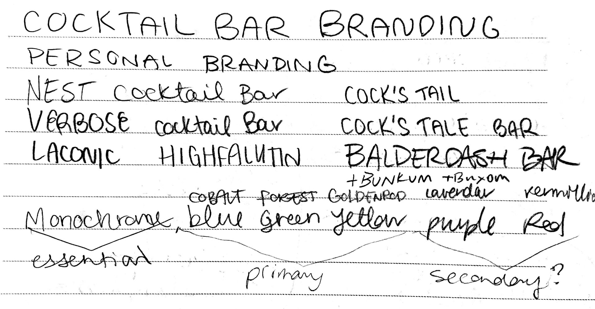
Branding isn't only the visuals, it's the name too. Here are some of the ideas that were floated early on, as well as the idea for the versatile color palette.
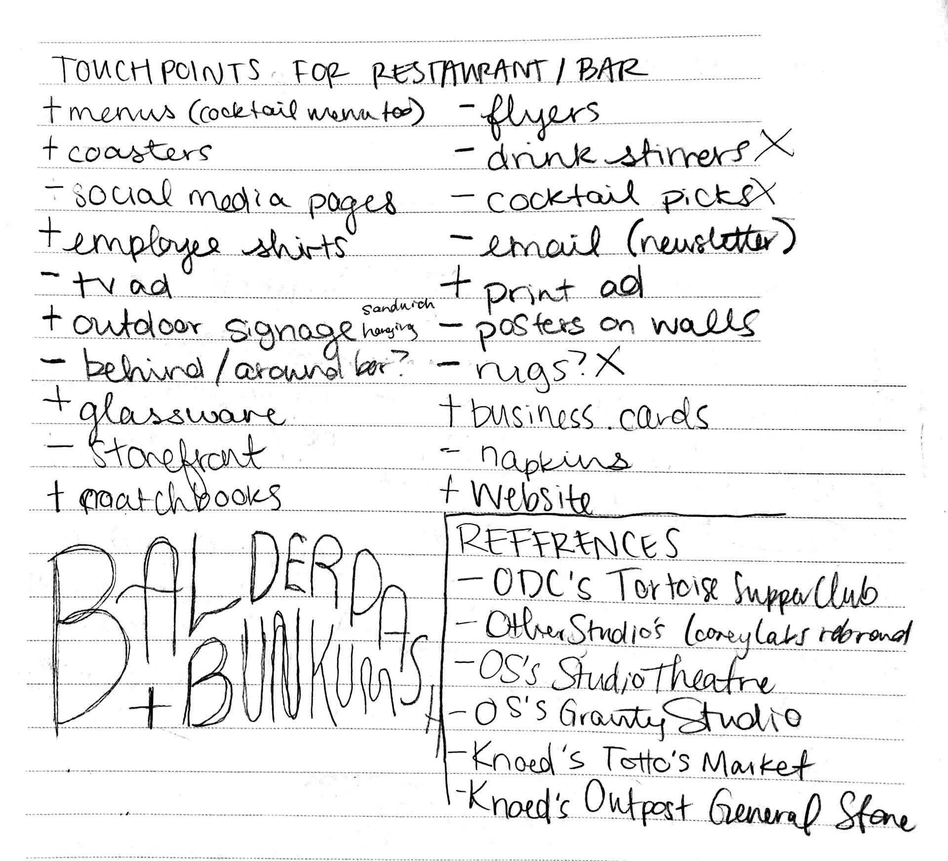
Touchpoints are crucial to think about as a brand is being strung together. Where will the mark be? Where could the mark be some day?
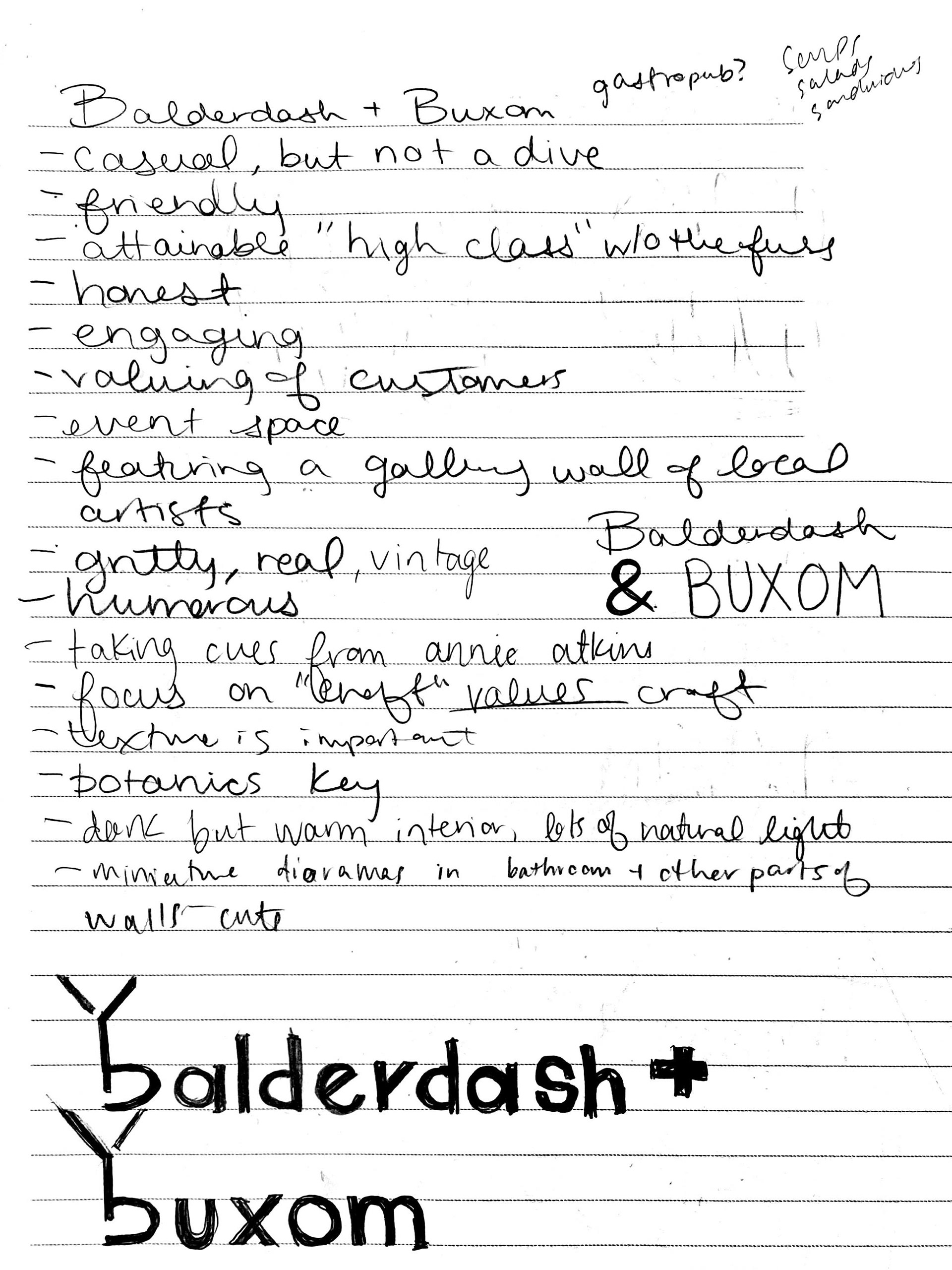
Understanding what the end goal of the company is a must if the brand is to support it. Here we can see some of the ponderings and another logomark idea.
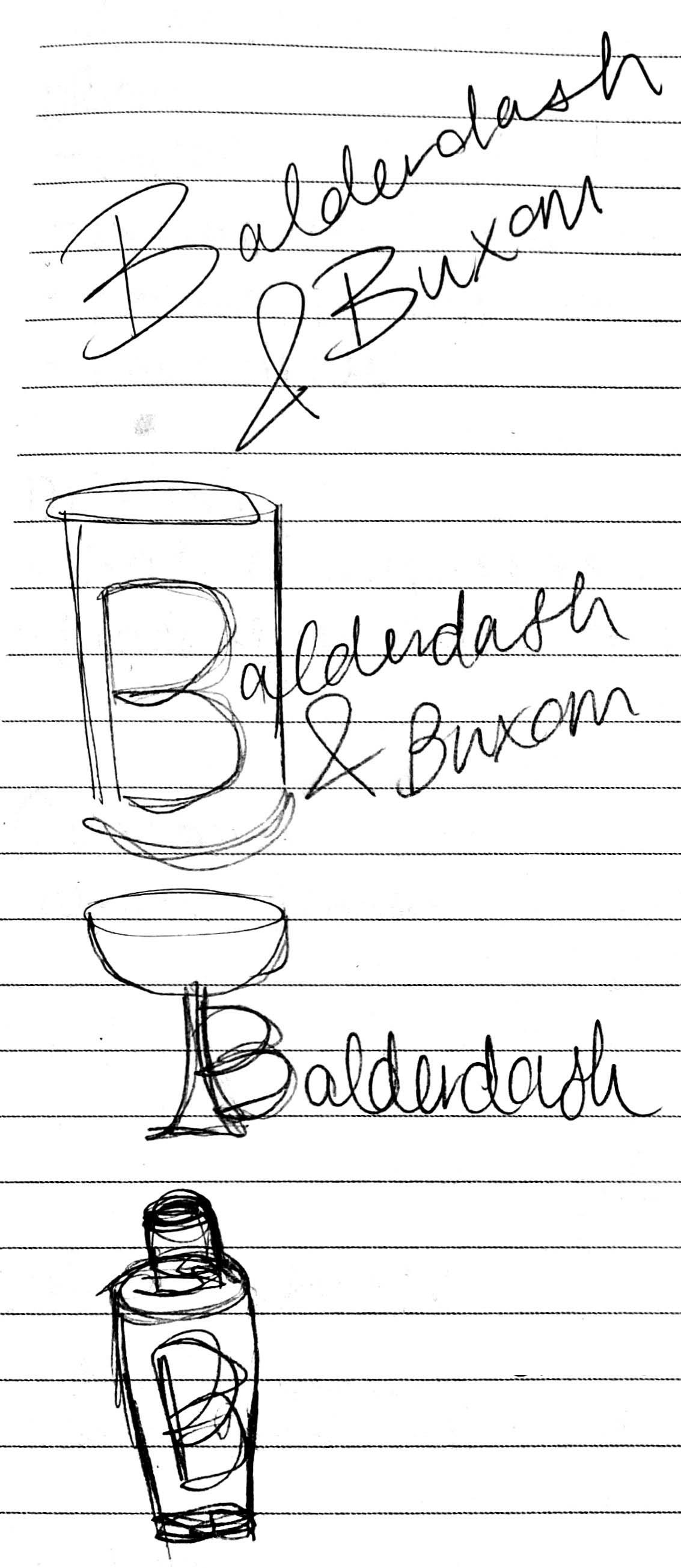
There's no wrong ideas when you're drafting, and that's half the fun of any project.
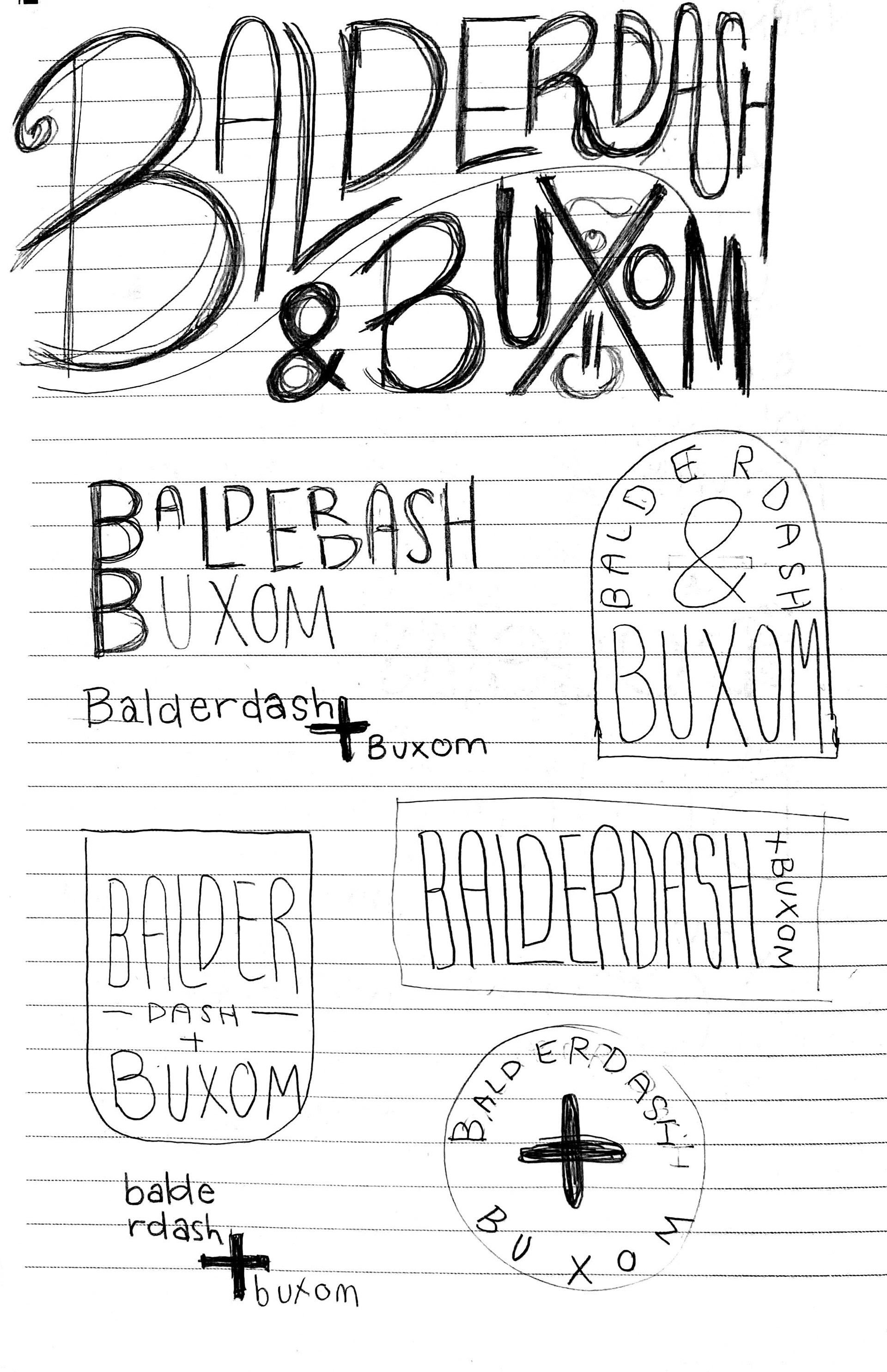
This page features the original sketch from which the final logo was derived.
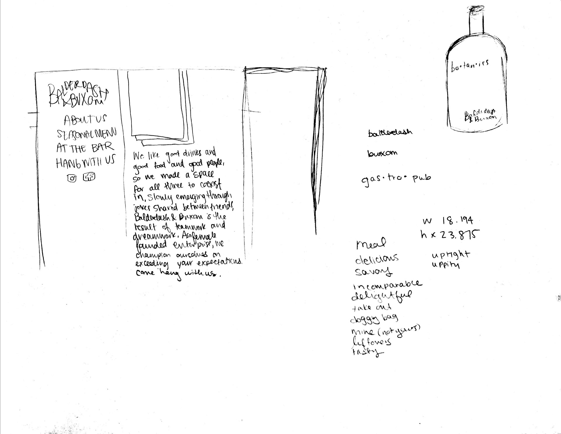
Concepting for the website.
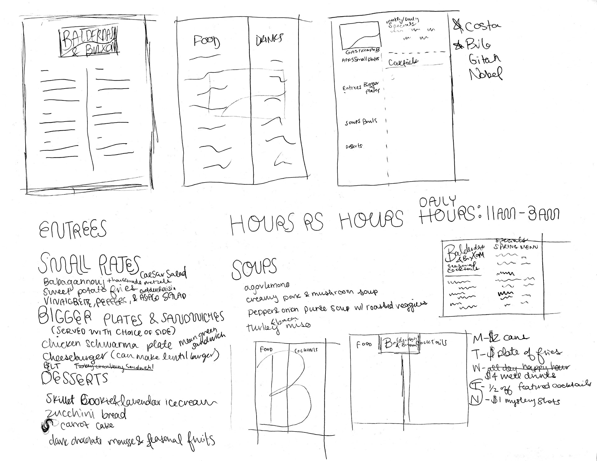
Exploration for both building and designing the menu.
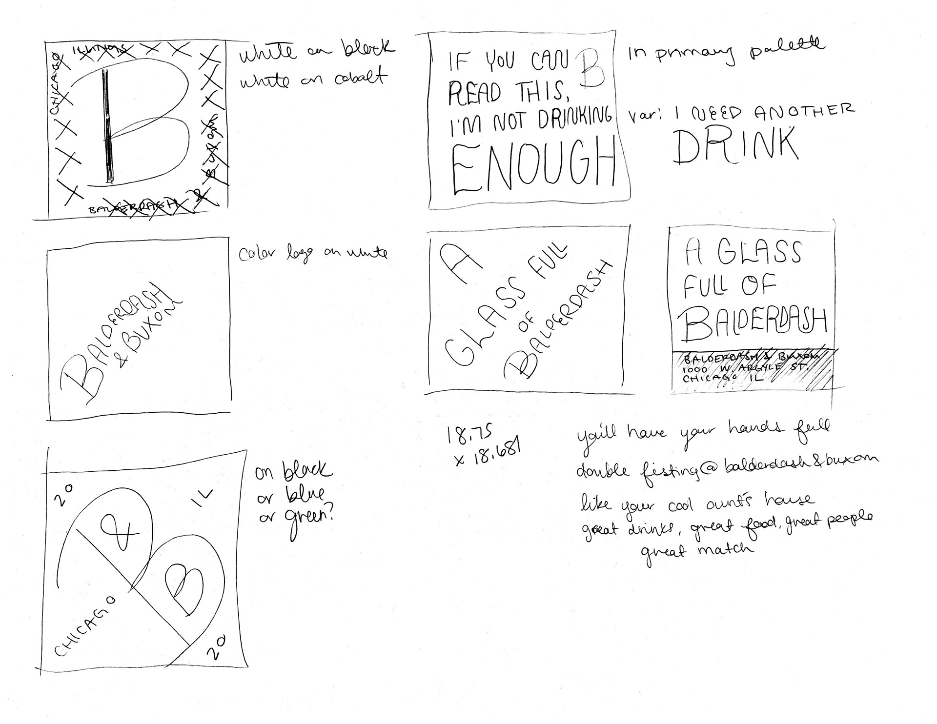
Coasters can be boring, or they can contribute to the atmosphere that they live in.

Take-aways like matches are great fun for visitors (especially those who forgot their lighter). Original sketches of the glassware featured on the employee shirts are also seen here.
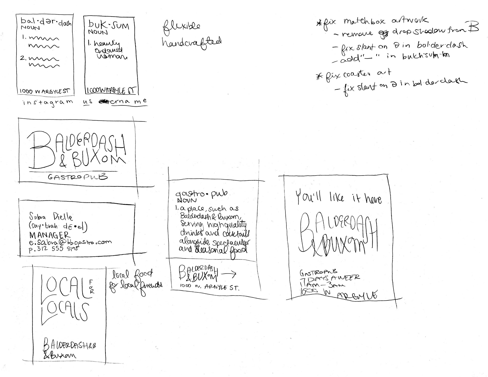
More matchbox drafting, plus an inside look at some of the adjustments that were made during the process of fleshing out the project.
Below is the iconic graphic of the Balderdash & Buxom employee tee; here it showcases the color palette of the brand. The colors work together harmoniously and offer flexibility for the ever-shifting pub.
The Buildout
After ensuring that the direction was sound, the rest of the work began. The brand incorporates a healthy dose of wit in its copy, which encourages the playful attitude exuded by the logomark. A motif of dictionary entries that dots the identity provides plenty of versatility when it comes to application. Whether serious or inventive, it's a recognizable format that can double as a source of information.


