Caxton Club Brand Refresh and Standards Manual
Lead Designer
The subject of this work is best explained by the club itself; "The Caxton Club was founded in Chicago in January 1895 by fifteen ardent bibliophiles. According to their charter, their intent was 'the literary study and promotion of the arts pertaining to the production of books and the occasional publishing of books designed to illustrate, promote and encourage these arts.' Today, the Caxton Club numbers over 300 resident and non-resident members of all ages—authors, binders, book artists, collectors, conservators, dealers, designers, editors, librarians, publishers, and scholars—who still share the love of books.
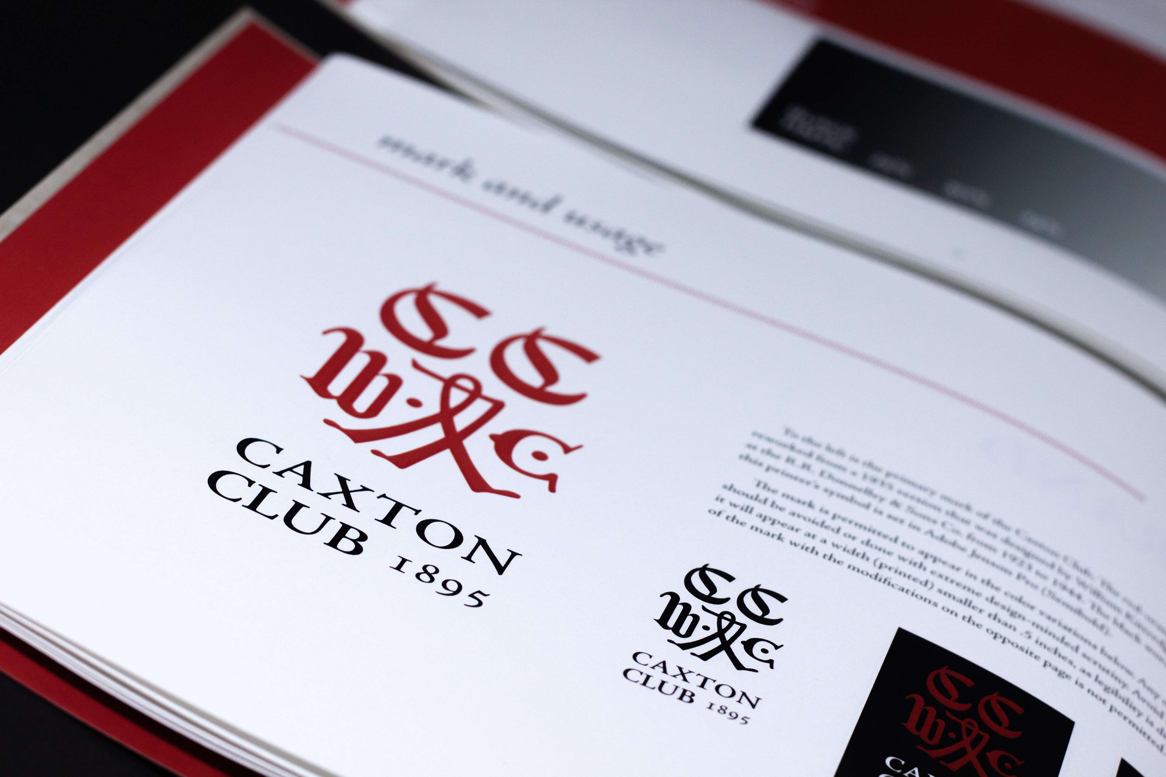
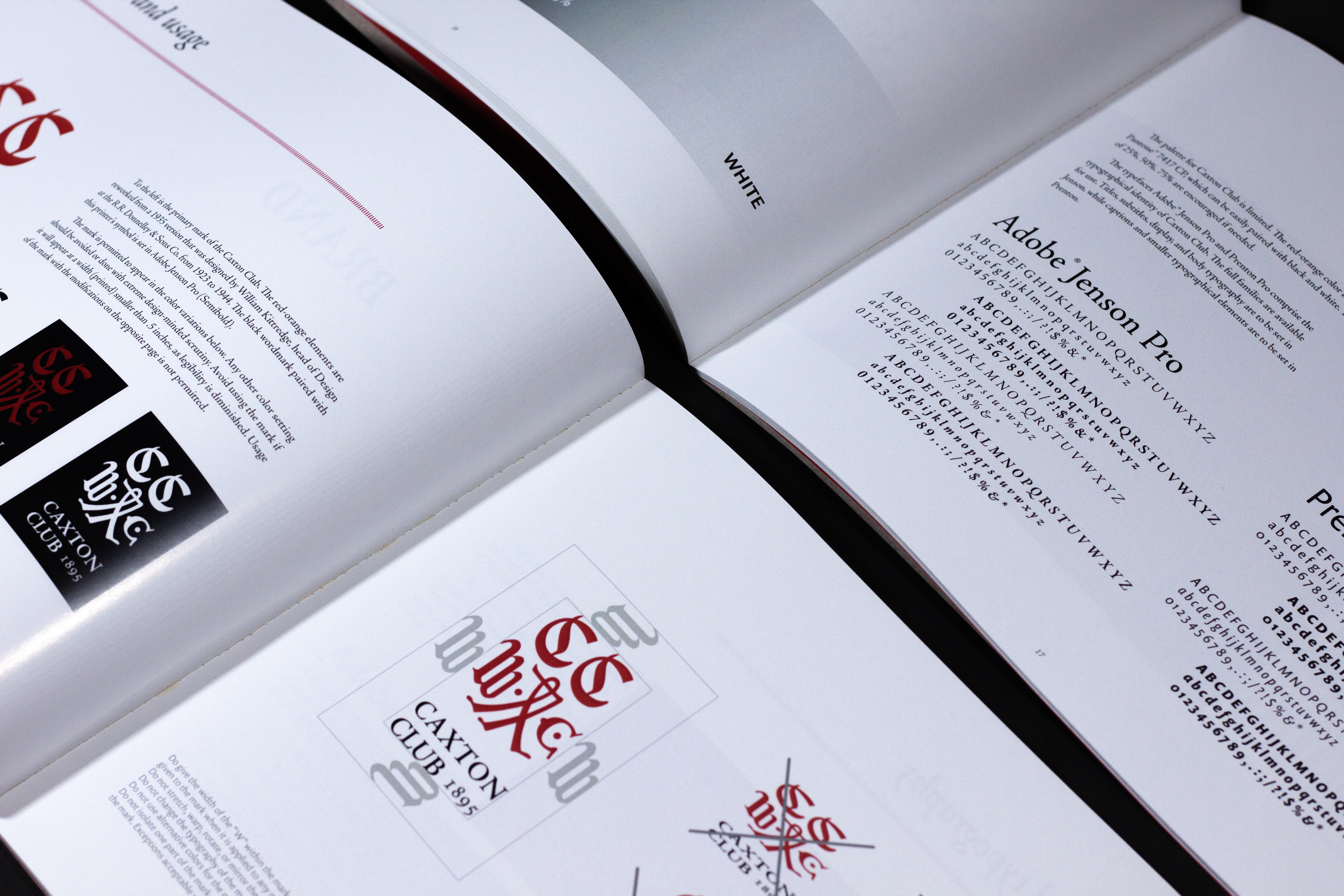
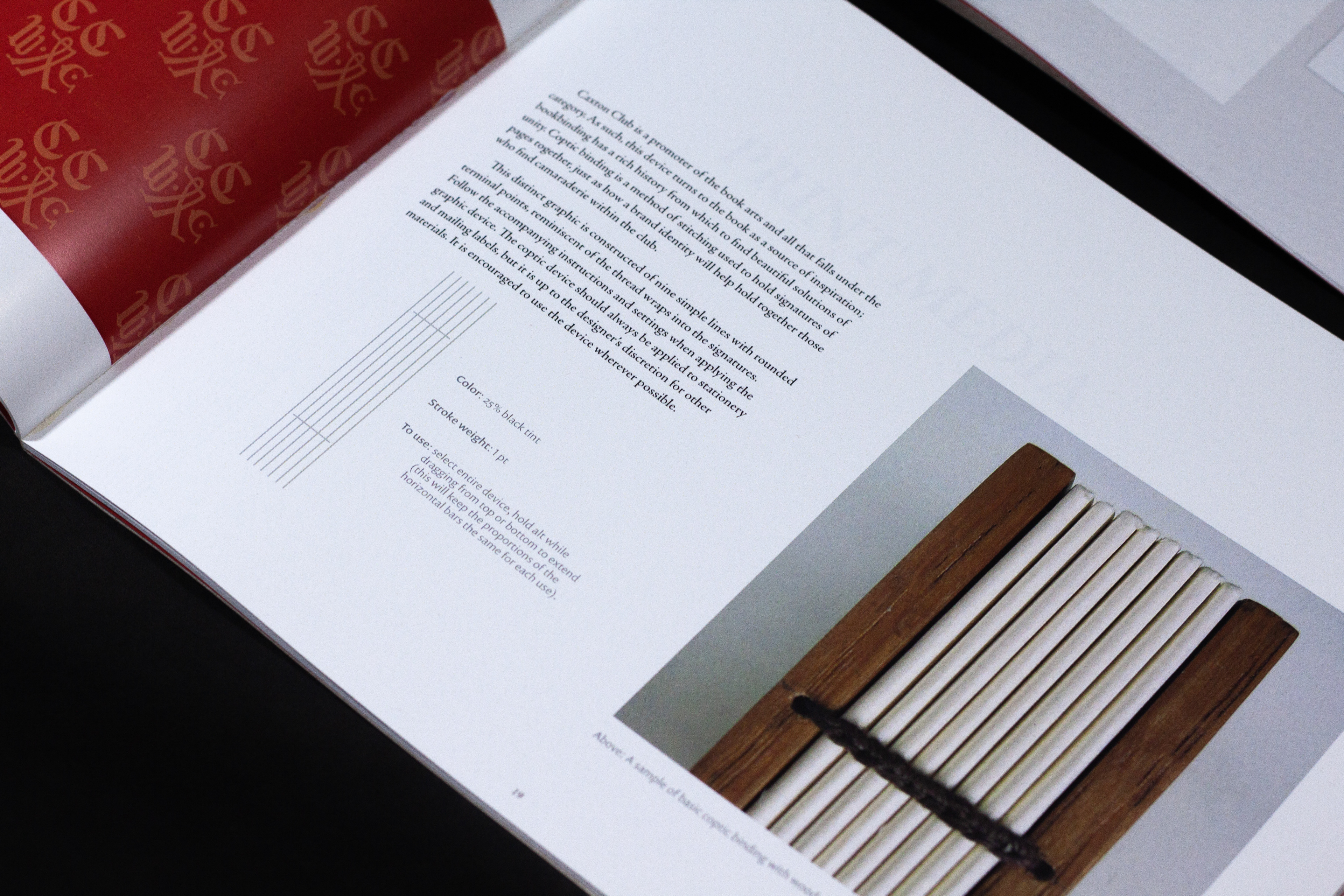
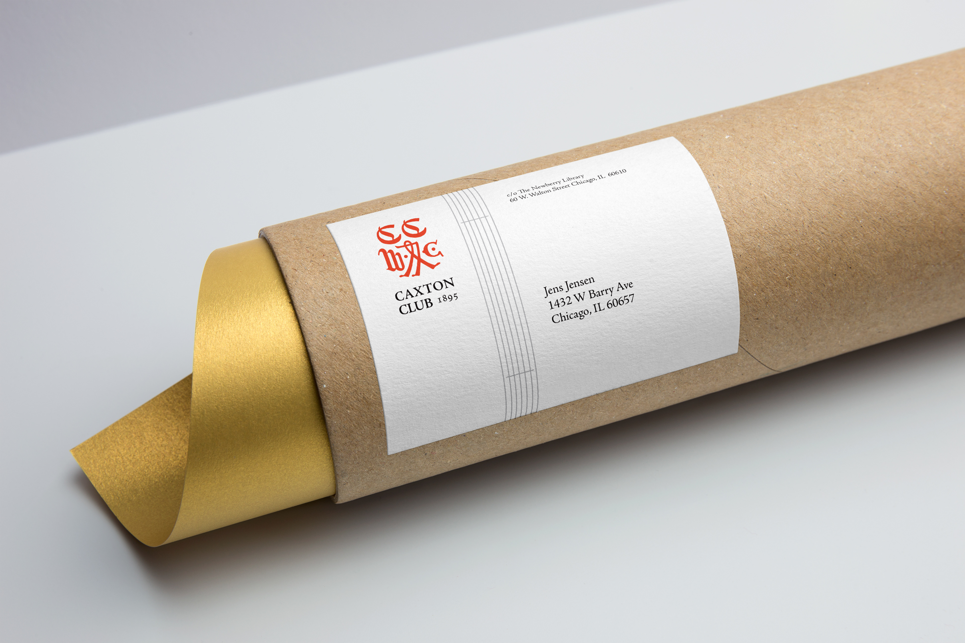
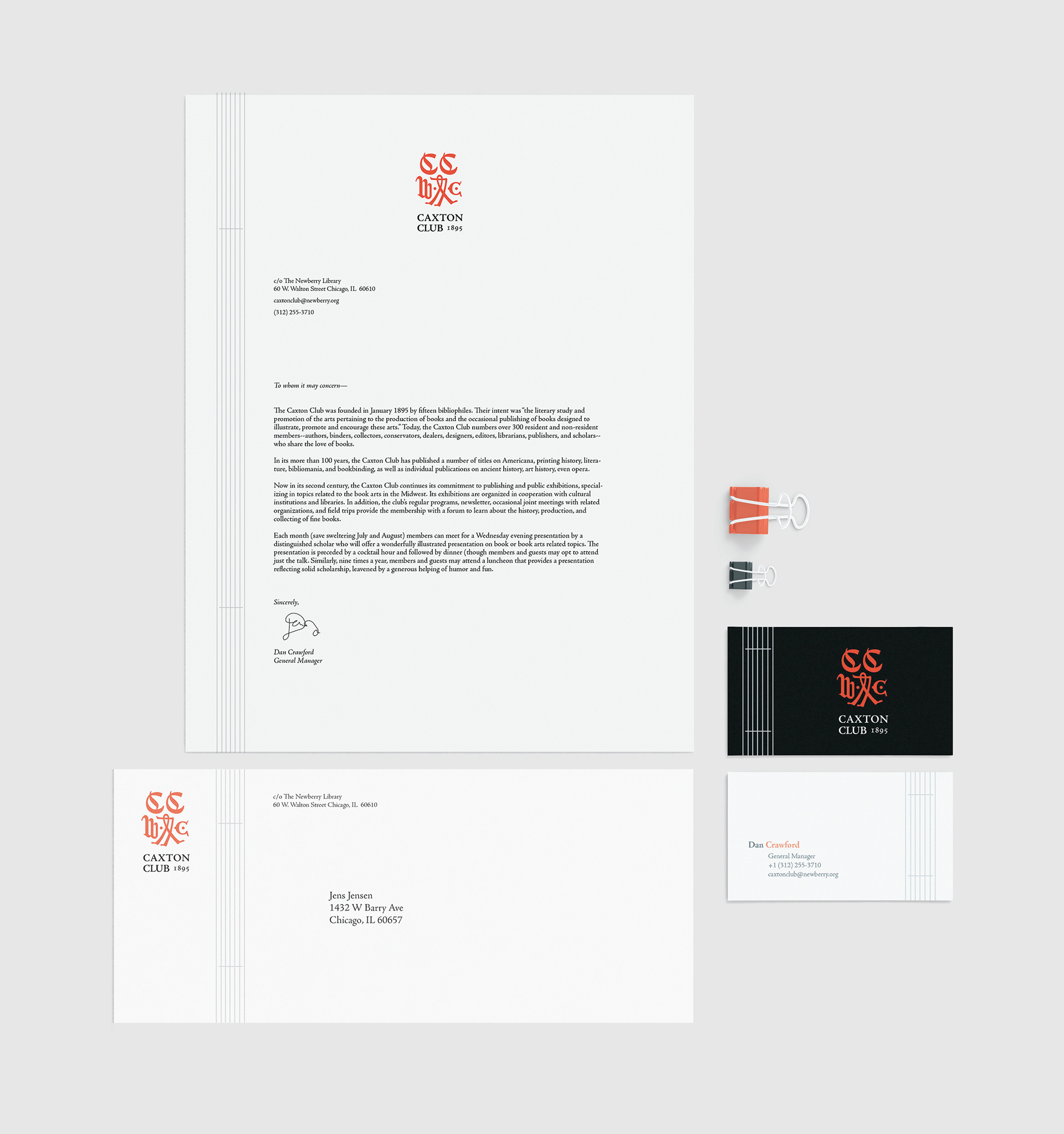
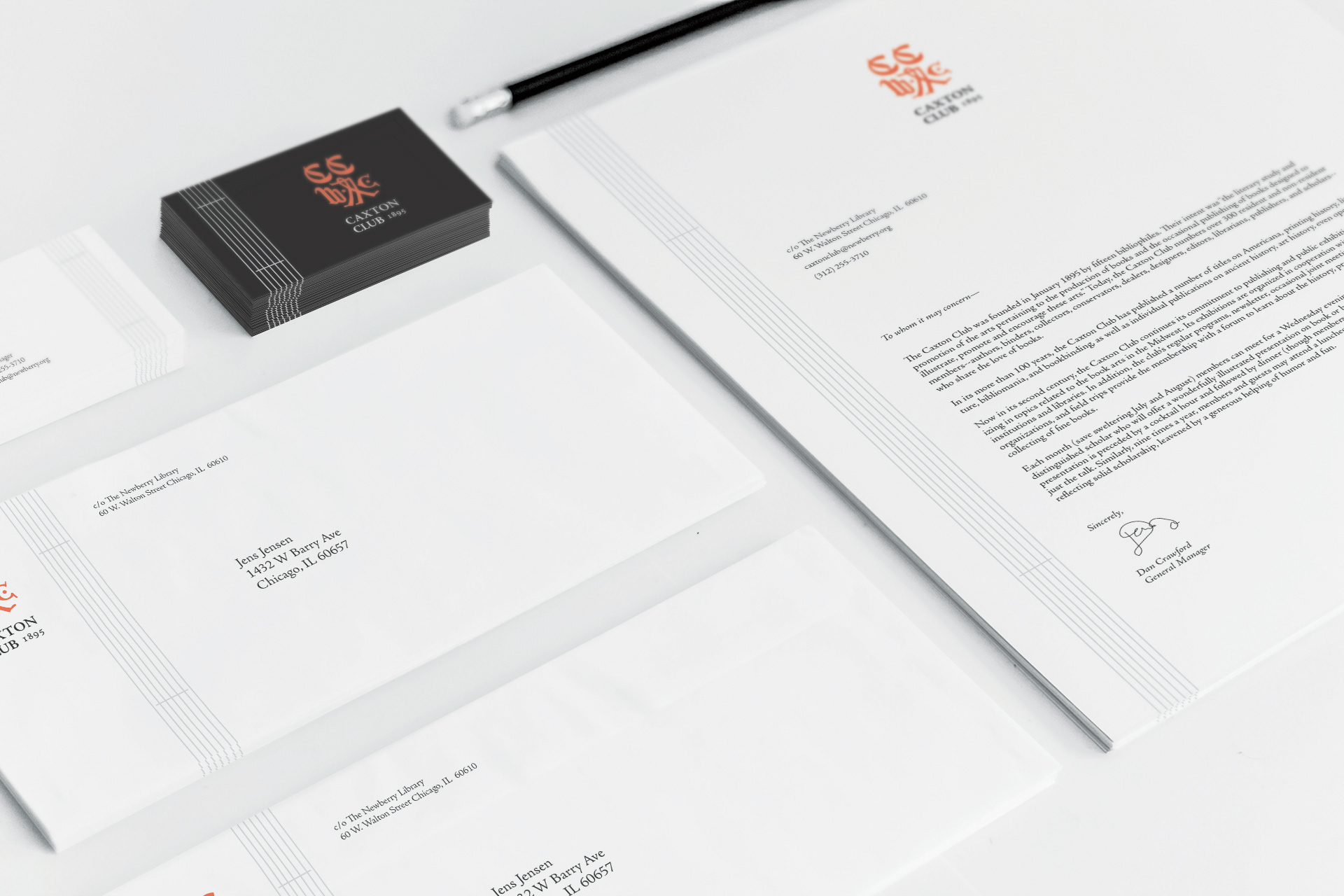
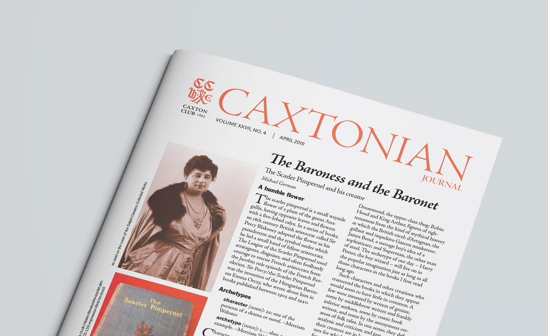
As the club was approaching their 125th Anniversary, there was an increasing pressure to solidify the visual identity of the group, which had been in flux since the club's inception. Working with a team of three other designers, we devised a refined mark and visual devices to unify the items released by the organization.
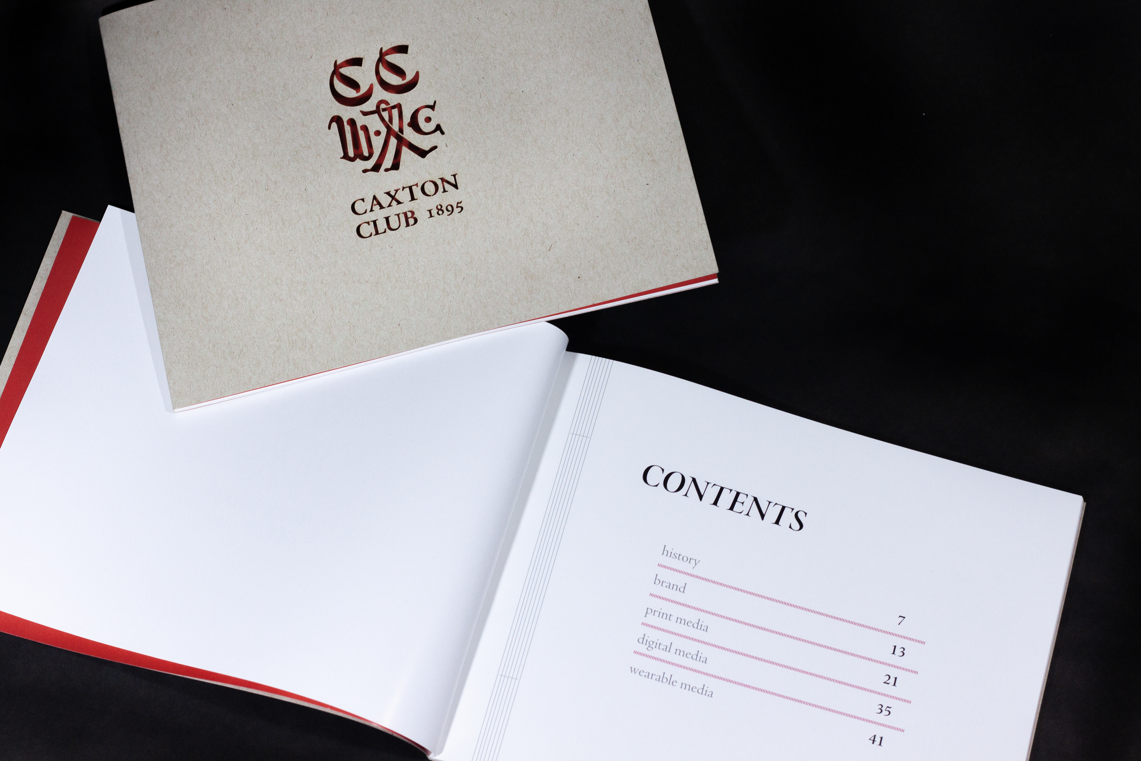
This edition of 10 manuals were printed at Columbia College Chicago's Digital Print Center, with custom covers that were laser cut in the Fabrication Facility at the same school. The closed book measures 8" tall by 10" wide.
Scope of work included research, design, implementation, copywriting, proofing, and prepress preparation.

Of Caxton Club Past
The image below was taken within the archives of Caxton Club at Newberry Library. The red-orange vermilion color seen in the top row was a common ink color during the early years of the club's existence and is where the new identity draws its vibrant look from. The maroon of the old identity is no longer welcome on the group's materials—for the better.
See the transition from the dry and dated mark in maroon to the new, vibrant and dignified identity of the group.


